Guide to images in email
Images can be what makes or breaks your email. Literally. For those that heavily lean on images in their emails, if your images are too large, formatting isn’t supported, or they take too long to load, you won’t have any content to share to your subscribers The success of images rendering is essential if you’re going use them in your emails. So, what should you know when working with images in email?
What is the largest image file size you should include in an email?
Most sending platforms have strict requirements for what images can be uploaded and sent in your emails. For example, Customer.io has rules that outline a maximum file size of 1 MB and automatically compresses images more than 1800px wide. But what if you’re hosting your own images? Should you still abide by the file size rules?
Let’s put it this way; we’ve all experienced the pain of slow cellular network speeds and wifi that you aren’t sure if is legit or not. The pain of waiting for something to download or load is a digital frustration we don’t wish upon our worst enemies.
You want your email content to load in scenarios like the above. And when you introduce larger file sizes, you risk losing subscribers and their interest due to the time it takes for something like that to fetch and load.
Across many tools and blog articles, we’ve seen recommendations on what file sizes should be used in emails (ranging from 300KB to 3MB) but not much supporting information on why. To avoid Parcel falling into the same bucket, we recommend abiding by your email-sending platform's recommended size and keep in mind the end-user experience if you choose to send large images. The Email Markup Consortium is looking to dig into the “why” in relation to what image size best practices should be and we’re looking forward to some data-backed claims.
If you are hand coding your images or building a template from scratch, set image height and/or width inside your HTML to manage their dimensions.
Setting these on your image tag such as:
The width="" attribute is the width of the image in px Outlook needs this to be set in the attribute rather than the style.
In the style="" attribute, we can set a width again, this is optional, but it allows us to use relative units like em which will respond to the font size.
We also set max-width:100% this is useful for allowing images it automatically shrink down when viewed in smaller viewports.
You can also set height as an attribute. When setting both height and width, the image size will be shown even when images aren’t loaded. However, when setting a fixed height and using max-width:100% that can distort the image, so you will also need to reset that back to height:auto in your style attribute.
In short, here’s what we recommend when it comes to formats:
- If the image has only a few colors or some transparency, use a PNG.
- If the image is an animation, use a GIF.
- If the image is a photo or has a lot of colors, use JPEG.
- If you feel confident in your code and QA skills, you can cautiously experiment with more modern image formats.
But let’s break them down a bit better. Several image formats can be used in HTML emails. Some of the most common image formats used in email HTML are:
PNG images are a popular choice for emails because they can be high quality, allowing for granular detail when things like text. They are a good choice for logos, icons, and illustrations. The downfall is because of their high quality; they can potentially come with a larger file size. If there are only a handful of colors used, they are very small; however adding more colors into the image like in a photograph, can dramatically increase the file size.
JPEG images are widely used in email because they can offer high-quality images with small file sizes. They are a good choice for photographs or images with lots of colors with a smaller file size.
GIF images are commonly used for simple animations, such as a loading spinner or a small animation that draws attention to a certain area of the email. They have a limited color palette and are not suitable for complex images.
Animated PNG images can offer the animation from GIF’s at a higher quality and smaller files size than a PNG file. However, they don’t yet work in as many places as GIF animations, and in places like Gmail and Windows Outlook will only show the first frame of the animation. APNG can be used, but there is a trade-off between image quality and wider support in email clients.
WebP images offer the same advantages as an animated PNG with the added color range of a JPEG. However, when opened in Gmail they will convert to JPEG, and in Windows Outlook the image will be broken and not show. If you want to use WebP, then we would recommend adding a fallback image and doing a lot of testing to make sure every user gets a good experience. In addition to this, some ESPs may not support these images if you are using your ESP to host.
Scalable Vector Graphics (SVG) are a vector-based image format that allows for high-quality images that can be scaled without losing quality. They are great for logos and icons, but are limited when used in email design as email clients do not widely support them. We’d recommend only using this as a progressive enhancement with a good fallback image. This can be done by adding the SVG using a srcset attribute while using a better-supported image in the regular src attribute.
We don’t know if this is a question anyone is interested in, but we’ll answer it as if you want to know the sweet spot for the number of images you should use in an email.
You're using too many images if your email is entirely image-based and includes no live text. However, if your images are complimentary to text, and add value to the content! The email world is your oyster. Additional images will add to potential load time, so the number of them is definitely something you want to consider.
You might frequently hear the term “retina display” in relation to Apple products.
“The latest super retina displays across iPhones this, the latest retina displays on Apple watches that.”
Retina displays are characterized by their high volume of pixel density compared to a standard HD display. When considering retina displays, and emails, you’ll want to consider the quality of your images. Since retina displays have a higher density of pixels, your images could quickly become fuzzy if low quality. A common practice when it comes to exporting images for email, is to keep this in mind and actually export it with double the width and height.
Outlook doesn’t cooperate with background images. VML backgrounds are an option but they have several accessibility concerns, find out more in our Is VML accessible? article.
When choosing an image format for your email, it's important to consider the image's purpose, the file's size, and the email client that your subscribers will be using to view your email. Some email clients may not support certain image formats, so it's important to test your email in different email clients to ensure that your images are displayed properly.
Image-heavy emails will go to spam
One emails’ spam placement most likely is not correlated with the images inside of it. Instead, spam placement will be correlated with the reputation of the sender the email originated from. If inboxes take note that individuals are marking the email as spam, or sending it straight to the junk folder, the inbox will take action to protect other recipients from a sender because it fears that there may be unwanted touch points occurring.
If you have issues with your emails, such as images not formatting correctly, not only does this present accessibility issues, but it also could definitely correlate to a poor user experience that drives subscribers to take the actions listed above — which in time, could impact your reputation.
Image-only emails are bad
Let’s define “bad.” If we define bad as an email that lacks accessibility, could take a while to load, and might not reach its entire audience, then yes, image-only emails are bad.
We assume that instead of live text, you have created images with text baked into them. We are assuming that instead of creating separate images for mobile and desktop, you are using one image for both, which results to the text being incredibly small to read on mobile because the image doesn’t scale with the device size.
If you do go down the path of image-only emails, we absolutely recommend QA’ing to review your alt-text.
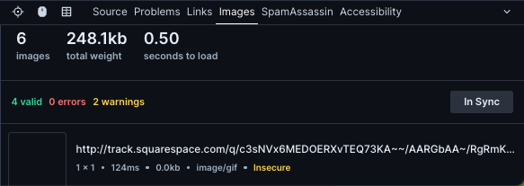
With Parcel Image Validation, you can first and foremost get an image count, total weight, and time to load, but you can also check to ensure all your images are secure.

If you notice your links are insecure, the fix will likely be that you need to add an SSL Certificate to your domain.
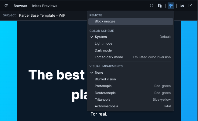
To QA your email without imagery, you can easily Block Images from the Visual Preview Dropdown.

Do you have questions about imagery in email? Drop us a line; we’d love to include more in this guide for others!